10 months ago there were very few signs of 3rd party add-on blocks for the Gutenberg editor. But now there is a feast of add-ons just in Time for WordCamp Toronto 2018 plus the imminent arrival of WordPress 5 Final Release. And two of the Gutenberg Add-on blocks, Caxton and kadence, have solved the Multi-columns row problem plaguing Gutenberg’s Columns block. So a review of the Gutenberg add-on blocks would appear to be timely for three added reasons.
First, WordPress 5 Final release provides a huge gob of fixes making Multi-column rows and full width elements finally work [most of the time]. But also some misfiring blocks work better. Gutenberg is by no means near the PageBuilder feature levels – true WYSIWYG UIs, easy CSS styling of all blocks or powerful templating of section, page or complete website designs. But Gutenberg is garnering more developer interest as reflected in the number of users of the tool. But of equal importance is the number of add-0n plugins written to support Gutenberg. Just like popular WordPress PageBuilders like Elementor, Site Origin and Visual Composer, Gutenberg has seen in the last few months a score or more of new, free and premium support plugins appear in the WordPress Repository or in online shops.
Second, the amount of innovation shown in those support plugins adds to the functionality of a plugin but also shapes the original tool. This innovation is now appearing in Gutenberg – but a lot of the borrowings are from PageBuilder UI/UX designs. Thus, like the templates appearing in Visual Composer, add-on plugins certainly defined the basic template support seen in Gutenberg
Third, and most telling ,the argument has been made here and here that Gutenberg blocks could mark the death knell to the currently thriving PageBuilder sub-industry. The essential argument is that the developer community would flock to Gutenbeg’s JavaScript-based blocks because they would be faster than many PageBuilder plugins using PHP which cannot match Gutenberg’s JavaScript. Also Gutenberg would overtime provide a common, standard library of UI/UX functions for developers to use replacing the incompatible PageBuilder libraries. Added to the Gutenberg speed advantage, would be the appeal of DIY WordPress functionality by assembling components with “no programming” required virtues as well. The validity of these arguments will be examined in detail below.
In sum, a look at the the strength of the support cast of add-ons is another measure of the overall worth of Gutenberg.
The Roster of WordPress Gutenberg Add-ons
If you had looked on January 1st 2018 for a list of Gutenberg add-ons, that would have been very small – barely half a dozen, That has certainly changed with nearly 20 Gutenberg add-on plugins now available as WordPress 5 nears release. Now we considered listing the Gutenberg Add-on Blocks by ranking but have defaulted to alphabetical order. But we have done rankings of the add-ons with the following criteria:
-
- There are a few add-ons which have unique and very innovative blocks;
- Too many other add-ons provide simpleton or duplicate features;
- Sparse CSS Styling options are the Achilles heal of Gutenberg blocks, some top add-ons show this is not necessary;
- Comparisons with what can be done in equivalent PageBuilder widgets are made;
- But a key criteria is that some blocks are still buggy or running awry.
So here presented in alphabetical order are the current crop of Gutenberg add-ons, with a quick evaluation of their overall effectiveness.
Some color coding hints about the 217 blocks:
Yellow highlight indicates there are 4 or more 3rd party duplicates of this block
Orange highlight indicates this block duplicates a Gutenberg native block plus other 3rd party blocks
Green highlights a truly innovative block, worthy of your consideration- there are 31 high rated blocks
Pink highlights blocks are still not working in full WordPress 5.0 release
Overview of the Gutenberg Add-ons
This list of add-ons and their features will be subject to very fast change. Just in the month of November there were many changes in the add-ons – new blocks, bugs finally removed, changed CSS styling options, new bugs, added features. So take this review as a snapshot of the Gutenberg Add-ons subject to fairly drastic change in the next half-year.
Next to note is how many of the addon’s blocks are redundant – 112 are almost exact duplicate blocks repeated at least 4 times over. So users and developers will have to work through and discover which is the best of the duplicates. But another problem is by choosing a specific add-on plugin, there will be many extra unused and redundant blocks. This is the same problem PageBuilder users have encountered.
Over the past 1 to 2 years some of the PageBuilder widget redundancy has been weeded out. Also many PageBuilder and add-on plugins allow users to choose which widgets/elements will be activated. Finally, there are plugins that allow users to turn on and off plugins use on specific pages, posts and custom post types – but this puts an added performance tuning burden on developers.
Finally, most of the Gutenberg add-ons tend to have minimal use of CSS Styling options with the possible exception of the top rated add-ons. But even these top Gutenberg add-on blocks do not match the the richness and completeness of many PageBuilder’s CSS Styling options for their widget and design elements. For example, a Heading widget in Thrive Architect has main CSS options for font type [100s of Google fonts], color, size, line height, spacing and background color. Then there are the common Thrive widget options for layout and positioning [margins, padding, alignment], 4 background and styling options, 5 borders and corners options, two dozen animation choices, 8 shadow options, and 3 responsive settings. Nrmally users can safely ignore these options – but there are times where their use is essential.
In contrast, the Ultimate Add-on block’s Advanced Heading has color and sizing options for the text, 6 tag type choices, 2 color and sizing options for the separator and that is all. No margin or padding settings. No background color or gradient or image options. No border or corner options. No animation choices. No shadow options. And no responsive design settings. And this is the best of the Gutenberg blocks for CSS styling options. And so now you know the big gap between the CSS styling capabilities of Gutenberg blocks which are well behind the top WordPress PageBuilders.
So here are the top rated new Gutenberg Add-ons – Click on a button for more detailed info
Kadence Blocks- 9/10, for the neat innovation in all of Kadence blocks, especially dynamic styling
UltraBlocks – 8/10 for free plugin,10/10 for premium version at $19US/website unlimited updates
Atomic Blocks – 8/10, a Gutenberg ready theme plus 8 add-on blocks
Stackable Blocks- 8/10, largest collection of blocks, many duplicates but some real innovations too
Advanced Gutenberg – 7/10 with broad range of blocks, including accordion, grid posts, and tabs
Block Gallery – 7/10, good show of Gutenberg blocks for gallery images
Bokez – 6/10, many commonly used blocks, some styling control
Blocks-Kit – 5/10, the features of the blocks are often less than what is expected
Ninja – 5/10 so many blocks are underpowered in comparison to other add-ons
Premium- 5/10, still needs work to make the features stand out
Stag Blocks – 5/10, a lot of duplicate or buggy blocks
CoBlocks – 4/10, a lot of duplicate or low appeal blocks
GhostKit – 4/10, too many me-too or incomplete/buggy blocks offset the good blocks
Editor Blocks- 3/10, just not enough control and style choices for most of its blocks
Otter Blocks- 3/10, a lot of duplicate, simple or buggy blocks
Advanced Gutenberg Blocks – 2/10, a curious choice of blocks
Advanced Gutenberg – 7/10 with broad range of blocks, good layout blocks including accordion, grid posts, and tabs
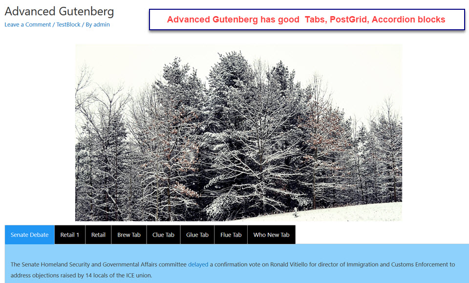
Accordion – much better styling than Advanced Gutenberg Blocks and Stackable but no images, icon or other blocks
Advanced Button – okay, but no unique features
Advanced Images – good control of height, width but no multiple image support
Advanced List – does offer more icon choices over Gutenberg list block
Advanced Table – okay, but still fixed width cells do not display properly
Advanced Video – much better than Gutenberg or Stackable video blocks
Count up – Not as good as PageBuilder widgets, only a few duplicates
Grid Posts – to my surprise many add-ons do a very good job Gridposts, lots of unexpected control
Latest Comments – unique feature which works well
Maps – unable to test with Google API conflict
Social Links – common add-on block, much less control in comparison with PageBuilder widgets
Tabs – good style options, but like accordion text content only
Testimonials – very common add-on block, robust like Atomic and Stackable blocks
Advanced Gutenberg Blocks – 2/10, a curious choice of blocks
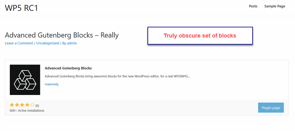 Advertisement – minimal options and control
Maps – unable to test with Google API conflict
Notifications – very common add-on block, minimal styling options
Plugins – works well, but supports an uncommon need to show basic WordPress plugin info
Text+Advertisement – same as Advertisement block except text area provided, hmmm not sure who needs this
Website Card Preview – minimalist
Atomic Blocks – 8/10, a Gutenberg ready theme plus 8 add-on blocks
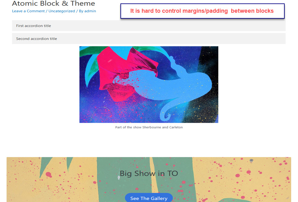
Accordion-okay, users add one at a time accordion elements; but the elements can be any block including a multi-column row
Button – okay ,simple controls
Call to Action – robust set of options, styling but not WYSIWYG and no repositioning
Container – works like a section in PageBuilders; but only 1 column of blocks which can have background image, color, margins, padding
Drop Cap – could not get it to work
Notifications – very common add-on block, minimal styling options
Post Grid – very common block, very well implemented here
Profile – fairly common addon block, the usual: image on left, Name, Title, Description…
Social Links – fairly common block, 8 social media, no color control
Spacer – Okay, drag and drop spacing but no divider
Table – Okay fixed width cells are working in RC2
Testimonials – very common add-on, simple control of options
Requires block to be activated to maintain layout when Classic Editor is enabled
Blocks-Kit – 5/10, the features of the blocks are often less than what is expected
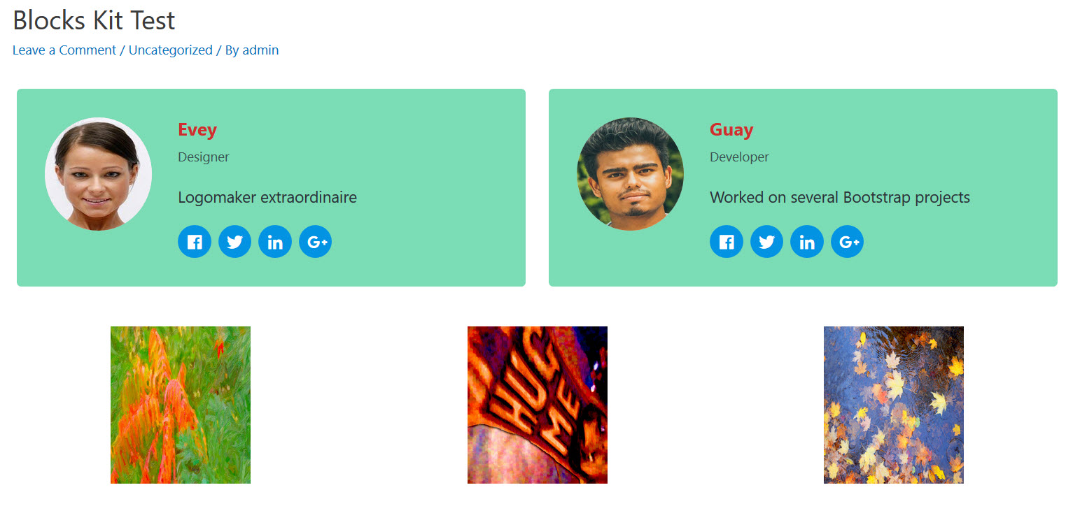 Advanced Header – has border around header statement, text, background, and bordercan be colored
Authors Profile – has image flanked by name, position title, description and upto 4 social links
Button – okay ,simple controls
Call to Action – Title, description button and not nearly enough CSS styling control
Divider Block – divider only, no integrated spacing features
InfoBox – allows up to 6 info boxes in a row with stacked image, title, description in each with minimal color styling
Notifications – very common add-on block, minimal styling options
Post Grid – very common block, very well implemented here
Pricing Table – up to 3 pricing tables with name, price, features and buy button; but styling is way off
Pull Quote – like Sticky Notes below, does not sit outside a block of text – user must emulate this
Social Links – fairly common block, 8 social media, no color control
Sticky Notes – does not overlay with transparency any other block, so what is its purpose?
Our Team – up to 4 team profiles with image, name, title, description stacked on top of up to 4 social links
Testimonial – there are bugs, it shows an non-responsive image area and the designation when erased just disappears
Requires block to be activated to maintain layout when Classic Editor is enabled
Bokez – 6/10, many commonly used blocks, some styling control
 Accordion-a very common block, a notch better then CoBlocks
Block Quote – fairly common block,nice color choices
Button – too simple, not enough styling
Call to Action – robust set of options, styling but not repositioning
Cover One – almost a duplicate of Profile block, redundant
Divider with Text – simple but novel as well
Notifications – very common add-on block, minimal styling options hohum approach
Post Grid – very common block, too simple, not as good as Atomic or Stackable blocks
Profile – fairly common block, the usual: image on left, Name, Title, Description
Pricing Table – pretty good, would love to reposition elements
Progress Bar – too simple, no description, manual repeat for multiple bars
Social Links – fairly common block, 6 social media, okay color control
Spacer – Okay, drag and drop spacing but no divider – they are separate blocks
Testimonials – very common add-on, simple control of options
Requires block to be activated to maintain layout when Classic Editor is enabled
Block Gallery – 7/10, good show of Gutenberg blocks for gallery images
 Carousel Slider – simple control for slider timing and animations
Masonry Gallery – surprisingly adept at handling Masonry layout
Stackable Gallery – least ambitious but works well – would be better as fixed width
The problem is that most of the best Gallery and Slider plugins have made themselves Gutenberg compatible…for example NextGen Gallery
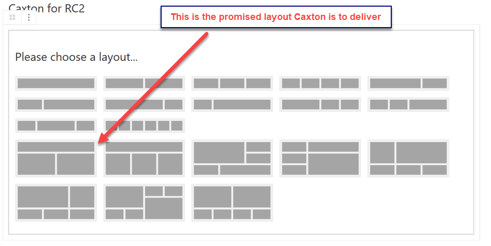
Caxton Block – 7.5/10, first Gutenberg add-on to rival PageBuilder widgets for design features; but too many incomplete blocks
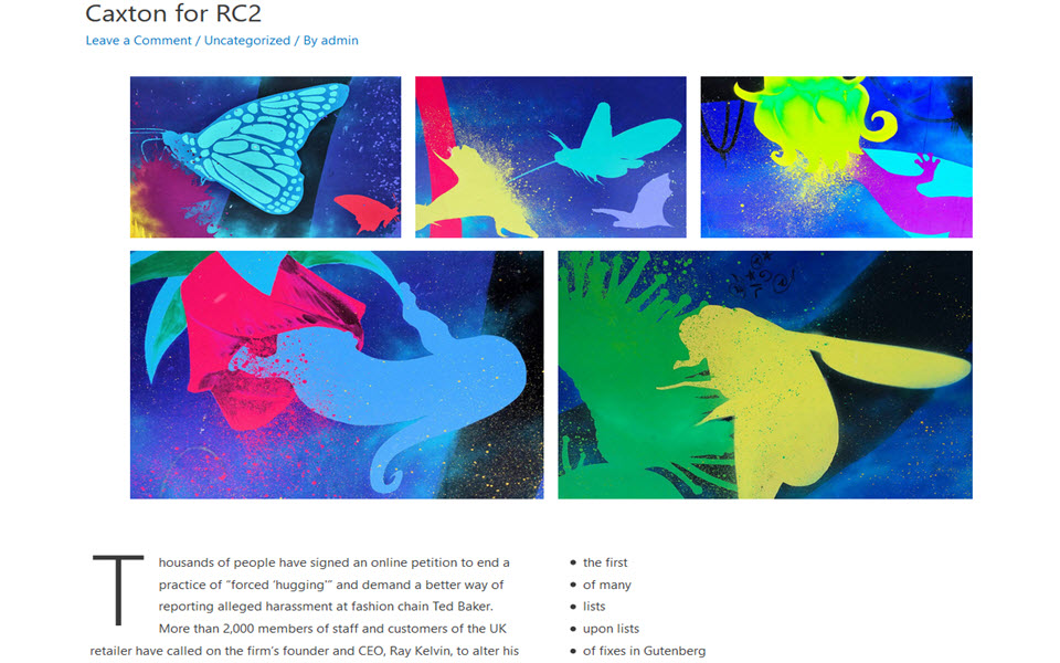
 and voila here is what Caxton does produce using the above template:
Button – Huge number of styling options including before and after icons plus- but would be nice to be able create several buttons at once
Easy Hero – great styling options, and true hero background image
Icon – So many styling options but too simple in features
Layout – the best multi-column row layout tool among all the WordPress add-ons
Post Grid – last add-on where one would expect to find a bug; but even in RC3 it does not work
Slider – this slider lacks image sizing and transition control, not ready for prime time
Shape Divider – just like in top end PageBuilders, you can have cool shapes dividing sections of your page
Social Links – hideous colors with no way to change, poor man among the social link add-ons
Super Hero – another layout marvel from Caxton; problem: display is excellent but editor view is very WYSIWYG awry
Requires block to be activated to maintain layout when Classic Editor is enabled
Coblocks – 4/10, a lot of duplicate or low appeal blocks
Accordion-very common block, suddenly broken in RC2
Author Block – okay, but looks like a testimonial block
Divider/Spacer – Yeah, combines the two with good styling options
Giphy – unusual block, that delivers user selected Giphy GIF
GitHub Gist – another pop in GitHub reference like in GhostKit
Highlighted text – this is easily done in the Classic editor bloc, so why this version?
Notification/Alert okay, just like other add-ons
Pricing Table – easy to setup and edit – still no repositioning of fields
Twitter comment – okay, but requires Twitter signin
Requires block to be activated to maintain layout when Classic Editor is enabled
Editor Blocks– 3/10, just not enough control and style choices for most of its blocks
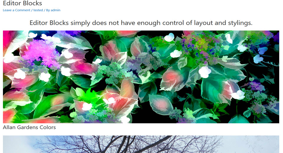 Brand Block – creates up to 4 stacked images – no text or styling
Call to Action – very simple, button and text field; no added elements
Feature List Block – up to 4 stacked features – image, title, description. Minimal styling available
Hero Block – is really a clone of Brand block single element; minimal styling available
Horizontal Feature Block – has stacked title, subheading, description, button, and image with minimal control and stylings
Intro Block – has title and description with color and font size control for each
Pricing Table – stacked up to 4 high with title, subtitle, feature price, description, button, and image. This layout does not work.
Vertical Feature Block – has stacked title, subheading, description, button, and image with
Team Block – just another variation on title/name, subtitle, description, button, image template
Wrapped Block – allows user to stack blocks in a container with background image or color and full-width coverage
Requires block to be activated to maintain layout when Classic Editor is enabled
GhostKit– 4/10, too many me-too or incomplete/buggy blocks offset the good blocks
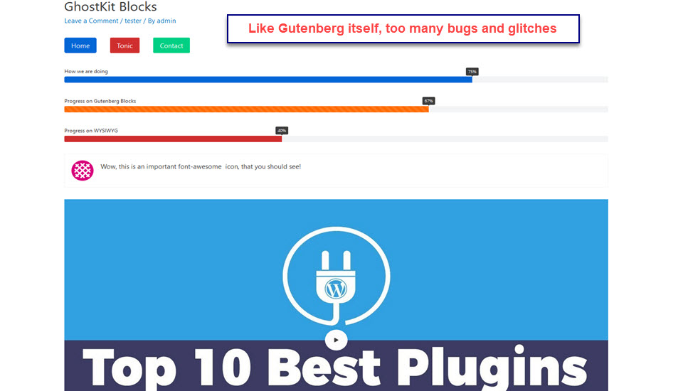
Accordion – like Tab below gets hopelessly lost adding new accordion elements and displaying them properly
Button – can easily create a series of inline buttons plus some good styling options; but persistent edit bug
Carousel – ambitious block with lots of options; too many don’t work
Change Log – useful alternative to under contruction note
Count/Number Box – like Icon Box, add-on combines Counter with Paragraph block
GitHub Gist – pop in GitHub reference on development work as required
Google Maps– not testing due to Maps API bug
Grid – looks good in editor but does not display properly even in RC2
Icon Box – Combines paragraph and Icon blocks. Set Font Awesome icon color, size and position- go here for Icon codes and help
Instagram feed – matches Instagram layout requirement
Notification/Alert – okay, same as other add-ons
Pricing Table – similar to Bokez add-on
Progress Bar – like Bokez add-on; but description, striping, and sizing are better in GhostKit
Tab – buggy in Tab edit and displaying tab contents
Testimonial – another Ghostkit combo block, but still resembles other add-ons
Twitter feed – resembles PageBuilders’ feed layouts
Video– very good video plugin with helpful control options
Kadence Blocks– 9/10, for the neat innovation in all of Kadence blocks, especially dynamic styling
Advanced Heading – nifty color and full Google Font choice
Button – like CoBlocks users can easily create inline buttons but better styling options and no bugs
Icon List – again, styling options add to usefulness
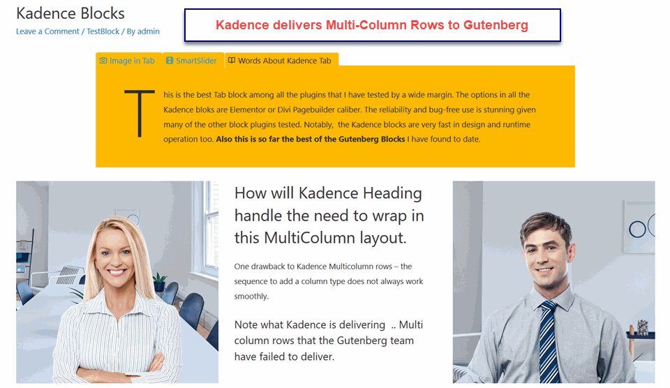
Row layout – Not as savvy as Caxton Layout, but robust and easy adding blocks into rows
Spacer/Divider – combine elements work well together
Tabs – allows multi column and multi-row content with nest styling options but NOT background image
Requires block to be activated to maintain layout when Classic Editor is enabled
Ninja Gutenberg Blocks – 5/10 so many blocks are underpowered in comparison to other add-ons
Button – fairly common block, simple options but no repeated buttons
Call to Action – this block is seriously under equipped; just paragraph text and button- call in Classic Block
Divider/Spacer – very common block; the divider with padding is the same as the spacer block – redundant
DropCap Block – this is just a paragraph block with a dropcap option – redundant
Heading – simple choice of H1 to H6, text color, and overall weight
Icon List – like Kadence, choice of several icons to use in list
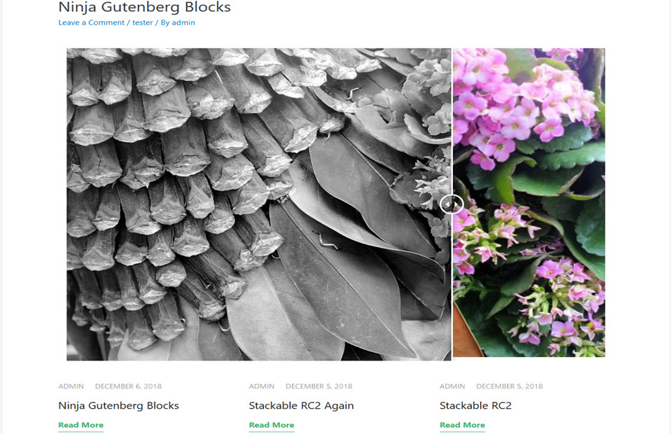
Image Comparison Slider – compare before and after images with horizontal slider; would be nice to be able to resize images
Notification/Alert – Ninja provides more color styling and icon use
Post Grid – a very well implemented Post Grid
Personal Profile Block – has image on the left, then stack of title, subtitle and description plus many styling controls
Social Links – repeats the same hideous colors of other add-ons
Testimonial Block – Ninja has most styling options than other add-ons
Video Block – again Ninja has most styling & control options than other add-ons
Requires block to be activated to maintain layout when Classic Editor is enabled
Otter Blocks – 3/10, a lot of duplicate, simple or buggy blocks
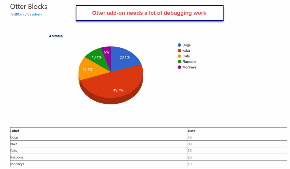 Accordion Block – In RC2 it easily adds more rows in each accordion element; but there are no styling options
Author Block – it works but is too simple
Google Maps – not testing due to Google Maps API bug
Icons – any editing breaks the block’s edit
Notification/Alert – okay, same as other add-ons
Our Services – Saam as Icons, any edit breaks the the edit
Pie Charts – effective 3D display; but no import of data
Plugins Block – gets neat info on your WordPress Plugins in use, card summary format
Pricing Table – 3 rows, prefilled but easily customized. Not as many options as Bokez add-on
Post Grid – again, it works but too few options compared to other add-on blocks
Social Links – 7 social sites, and choice of icon only or icon + social site name
Requires block to be activated to maintain layout when Classic Editor is enabled
Premium Gutenberg Blocks – 5/10, still needs work to make the features stand out
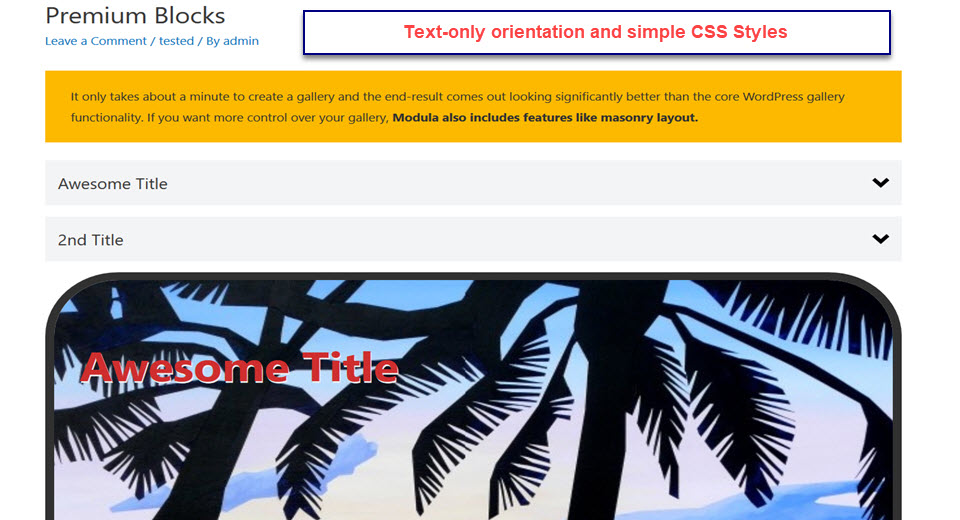
Accordion – multiple styled rows but text-only content but does toggle one row closed when a new row opens
Banner Ads – packed with controls but a bit clumsy finding option
Button – single button with many styling options
Countup Block – number with prefix and suffic plus description below; still buggy
Dual Heading – not sure why on this block; easily done in Classic Editor
Google Map -not testing due to Google Maps API bug
Icon Block – choice of dashicon or font awesome icons [but no search for icon feature] with links plus description
Pricing Table – should be used with Gutenberg’s Columns or Kadence Row Layout to best use its options
Section – is stackable blocks but there is a min height setting that actually works as a maximum limit
Testimonial – again works best inside Columns or Row layout block with description, image, name and subheading
Requires block to be activated to maintain layout when Classic Editor is enabled
Stackable Blocks– 8/10, largest collection of blocks, many duplicates but some real innovations too
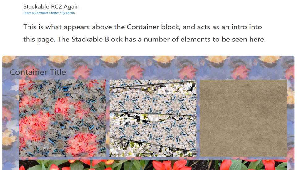 Accordion Block -very common block, easily adds accordion element, some styling but text only
Button Block – another common block, simple design and no easy way to create an inline block of buttons like Kadence or CoBlocks
Button Ghost – is just a Button Block with a transparent fill
Block Quote/Push Quote – like Button Block & Button Ghost, these two blocks have only slight style differences
Call to Action – a fairly common block, has a very rich set of styling options for title, subtitle and button in the block
Card Block – is like Feature Block – per row and the image is full width and on top of title, description, button
Container Block – a second add-on that does a very good Container block
Countup Block – up to 4 numbers for animated count up plus title & description, good stylings – best of the add-ons
Feature Block – 1 feature per row with cell on left having stacked title, description, button; right cell is image of feature
Feature Grid – up to 3 Feature cards with very simple styling – no font colors, font-choice, background images etc.
Expand/Show Block – is like a single entry Accordion/Toggle block, it has simple stylings
Heading/Hero Tile – full width background image with title, description and button plus simple styling
Icon List – similar to Kadence Icon List, choice of icons applied to all list items
Image Box – up to 4 images in a row with height and page span control plus on image titles/descriptions
Notification/Alert – the most common block; this version has average styling options
Number Box – provides circled numbers in 1 to 3 columns to mark numeric criteria/events
Pricing Box – up to 3 Pricing table elements with title, price, buy button , and description with limited font sizings other than color
Spacer/Divider – is a very common block, Stackable has them as separate blocks rather than combine them
Team Member – up to 3 clones of Testimonial block with a large image on top, then a Name, Title and Description
Testimonial – a fairly common block – instantly create 1 to 3 testimonials in a row with limited color styling
Video Block – standard YouTube and Vimeo support with simple styling
Requires block to be activated to maintain layout when Classic Editor is enabled
Stag Blocks – 5/10, a lot of duplicate or buggy blocks
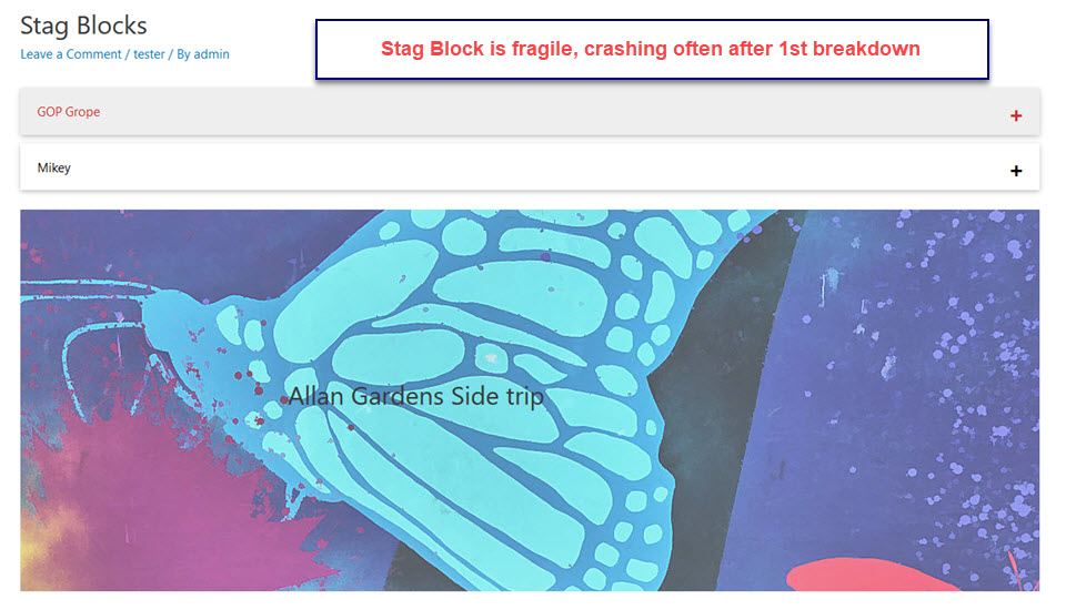 Accordion-very common block, a notch below Kadence block because its content is text only
Container – breaks the editor in RC3
Grid Post – another solid Grid Post block with full set of features
Hero Block – good with Title/subtitle link button and full width background image and styling
Notification/Alert – a very common block with a touch more color and border styling then others
Pricing Table – easy to setup 1 to 4 columns with offer, features, price and buy now button
Profile Block – crashed when trying to return for additional edits in RC3
Stats Card – like Pricing Table easy to setup for 3 to 4 cards per row, simple color styling
Testimonial – very common block with ambitious color scheme
Website card – simple layout, could be done with Classic Editor with more features/style
Requires block to be activated to maintain layout when Classic Editor is enabled
Ultimate Add-ons for Gutenberg – 9/10 Brainstorm has an Ultimate Elementor Addon and the rich stylings are passed along
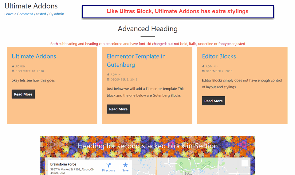
Advanced Heading – heading plus subheading both color and font size control only
Buttons – actually upto 5 inline buttons each many styling options
Call To Action – is also Icon/Info Box with superior styling controls, no block matches this one
Grid Post – solid with category filter, plus off/on control for title, comments, metadata like other post grid blocks
Google Map – second one to work properly
Icon List Block – up to 12 stacked icons with links plus description
Section – is like Stackable’s Container Block – stacking blocks for a common background and basic spacing
Social Links – up to 12 Social Link icon blocks inline with color and sizing controls, easy to search & find in icon list
Restaurant Menu – could be Product Listing in 1-5 columns image, price, name, description plus styling options
Team Profile Block – again image, name, position, description and social links with plenty of styling options
Testimonial – innovative Carousel of up to 10 testimonials with description, image, name and subheading
Timeline Block – Vertical alignment center or sideline connetions, tite, decription date plus color control of each event
Requires block to be activated to maintain layout when Classic Editor is enabled
UltraBlocks – 8/10 for free plugin,10/10 for premium version at $19US/website unlimited updates
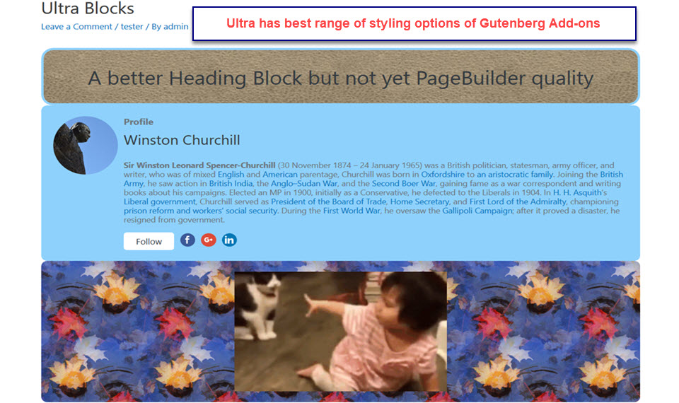 Accordion Pro Block – able to insert multiple blocks in accordion content; also broad range of stylings
Button Block – great styling options but cannot easily create inline set of buttons like Kadence or CoBlocks
Call to Action – a minimal version with title, description and button – no image or icon
Countdown Pro Block – many styling options including date/counter settings
Counter Pro Block – another counter block with wider range of icon and layout stylings
Expander Block – is like a single entry Accordion/Toggle block as in Stackable; this one is also text-only but has more stylings
Feature List Pro – provides horizontal or vrtical display of featuress icons and descriptions
Flip Box Pro – flip card with image, icon plus content; good styling options
Giphy Block – again Ultra wins on better styling options
Google Maps Pro – unable to test with Google API problem
Heading Block – has much better styling options than other header blocks
Hover Block Pro – variation on Flip Box with image and message resizing/opening on hover; wide styling choices
Interactive Banner Pro – label one or more images with animated text content
List Block – more style than other blocks; but no icon or font options
Paragraph Block – poor cousin of Ultra’s Heading block; not enough typography and color options
Pricing Table Pro – many options for layout, color, and features of Pricing tables in lineup of 2-4 Prices
Profile/Author Block – again, Ultra leads all other addons with of-on control of title, image, description, button, social links and styling
Reading Duration – obscure purpose for this block??
Quote Block – best of the blocks for many useful styling options
Spacer/Divider – separate blocks and basic styling options are simple
Team Block Pro – similar to Testimonial block but to 4 horizontal image, title/name, description with advanced styling options
Teemplater Block Pro -like Guteneberg’s Columns block but it supports multiple rows, wrapper background , and diverse stylings
Testimonial/Review Block – best of the addons for making 1 to N testimonials – title, description, image and solid stylings
TimeLine Pro Block – layout vertical list of steps with description on timeline
Requires block to be activated to maintain layout when Classic Editor is enabled
Some 1 Block Gutenberg Add-ons
There are some notable 1 block Gutenberg add-ons that meet specific needs uniquely well. Here is a small list that will likely get much bigger in time.
Block Options – this block works like Gonzales or Perfmatter. It controls which users and pages/post a Gutenberg blocks appears on. Neat tie in with ACF plugin.
CF7 Block – provides a block that Contact Form 7 widgets can run in Gutenberg edit session.
Disable Gutenberg Blocks – with so many duplicate blocks in add-ons this plugin allows you to turn-off the redundant ones
Features Block – provides special block features for use in the Gutenberg Editor
GamiPress – the easiest way to add gaming to Gutenberg pages, linked with several LMS-Learning Management Systems
Lazy Blocks Creator – another semi-automated Gutenberg Block creation tool
Reusable Gutenberg Block Widget – the title explains the use. This block allows the use of Gutenberg blocks in any widget.
Reusable Blocks Layout – gather Gutenberg add-on blacks into a template for reuse; all blocks used must be activated; still buggy
Organic Profile Block – There are lots of Profile blocks in our list of add-ons, this single block is the best one by a wide margin.
Theme Support for Gutenberg – enables wide and full width display option for any theme using Gutenberg editor
Some Notable Gutenberg Ready Themes and Plugins
There has been some concern about the readiness of existing themes to support Gutenberg blocks and add-ons. But in our testing of these add-ons, we found that almost all themes can display Gutenberg pages with a first level of fidelity. But the addition of Wide Width and Full Width to block display options, support for default Gutenberg theme styles and CSS option settings, and a number of editor fixes has caught a number of themes out from being fully Gutenberg compatible. So there is rush to do so. From our list of best MultiPurpose themes, four are ready for Gutenberg [Astra, Generate Press, OceanWP, PageBuilder Framework]. CodeinWP has a late breaking list of 15+ Best Gutenberg-Compatible Themes.

