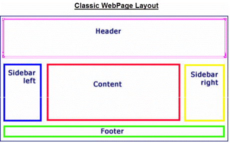
How New Web Design Has Changed and Obsoleted this Layout
As suspected getting through the the first of a WordPress Starters Guide proved to be full of questions and demos. And as presenter I should have warned attendees early at the outset that the sheer volume of material would necessitate splitting the presentation into 3 parts. This presentation on Present and Future Trends on the Web and in WordPress. A second part looking at Getting Started Using “Free” Hosted services like WordPress.com, Weebly and SquareSpace. Then a third and concluding presentation will look at Setting Up your Own WordPress key decisions about themes
Fortunately, Dale Campbell of DonebyDale.com, got this meeting started off with an overview of Web and Computing trends. This got discussions going which were picked up in the Web Trends and Glossary of Terms presentation. A number of topics and techniques were demoed with trends in the industry towards Security, speed of websites, and Design trade-offs touched upon Interestingly the Client Server model continues to refine itself with still a single client but more complicated interconnections within the Internet Cloud and the single Server long gone as many Servers interact to produce the Web page delivered back to the client browser today.
In that same vein, the Classic Blog Layout of Heder, Sidebars, Contenet Block and Footer has changed dramatically with advent of PageBuilders with drag and drop Webpage design. With today’s PageBuilders and their templates, end users can create and refine the look of their websites with greater ease and active participation. This topic will be discussed in the next two sessions.
Finally, thanks to the work of Veronika Doma, webmaster of TorontoDance.com website, we had a great Presentation Evaluation Form and 7 attendees filled out most of the form. Here is a tabular summary of that feedback:
| Organization | Knowledge of Presenter |
Delivery | Visual Aids |
| 5/5 | 5/5 | 5/5 | Not filled in |
| lots of terrific ideas – want more | |||
| 4/5 | 5/5 | 4/5 | 5/5 |
| Needs to use bigger type on slides | |||
| 4/5 | 5/5 | 4.5/5 | 5 |
| no comments | |||
| 5/5 | 4/5 | 5/5 | 4.5/5 |
| no comments | |||
| 4/5 | 4/5 | 5/5 | 4/5 |
| The presentation should include an example of how to setup a website | |||
| 5/5 | 5/5 | 5/5 | 4/5 |
| no comments | |||
| 4/5 | 4.5/5 | 5/5 | 4.5/5 |
| Great but not all material covered. Outstanding delivery. More site demos | |||
Clearly the feedback was largely positive. But several attendees were looking for a more complete presentation but in fact that would have required weeding out so much useful information, ye Organizer decided to lengthen the WordPress Starters Guide to a set of 3 presentations. However, some upcoming WordPress Meetups may fill immediate information needs. Consider going to Basic Plugins to Make Your Site Work on Feb 1st at Metro Hall , room 303 downtown Toronto.
To get the PowerPoint Slides slides and/or use the free PageBuilder testing send an email to me at jbsurveyer@gmail.com. Yes, the price of admission for the Meetup notes is an email address which will be used primarily once month to send out latest updates on the next Meetup content.
Finally, looking forward to the next meetup with Part 2 of WordPress Starters Guide upcoming Monday Feb 27th usual time and place.

