Okay what is a WordPress SiteBuilder? Shhh don’t tell anyone but this is the potent combo of a Multilayout Theme [think free Astra, Generate Press, OceanWP] with a top-end PageBuilder [like the free BeaverBuilder lite, Elementor or VisualComposer.io] These combo tools have created a new category of WordPress Frontend UI development- the WordPress SiteBuilder. This combo can deliver a unique look and layout for any or all of your WordPress pages, posts, and custom post types. Even better these SiteBuilders also deliver:
- Frontend, drag and drop, WYSIWYG page/post layout and design.
- User designed headers, footers, sidebars, call to action strips, etc; replacing the standard ones if desired.
- The resulting pages/posts are fully responsive displaying well on desktop or tablet or mobile phones.
- The amount of design control for color, typography, layout even animation is breathtakingly easy to do.
- The tools provide complete website or page or section of a page import and export capabilities – great for reuse on your website[s].
So our latest WordPress Toronto Meetup had a Live Demo showing what was possible with the New Sitebuilders. At the same time we were able to explore some overall design questions.
The Demo Setup
It took awhile to get a volunteer for a free landing page design, but Makeup artist Mindy Bharji from Brampton volunteered her website BeautyBliss.ca:
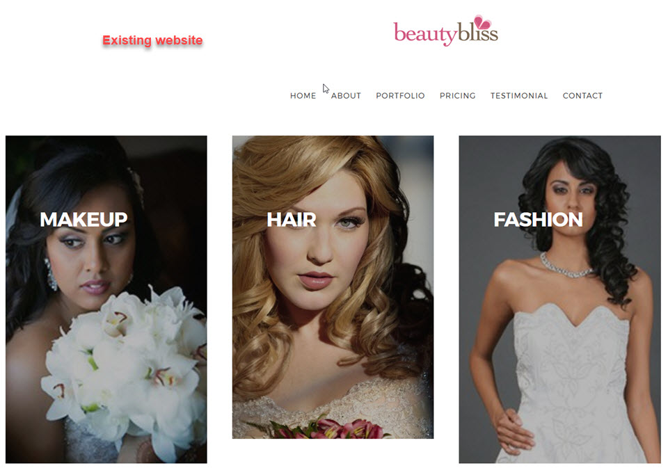 The existing website has a simple menu of six pages plus an image for each of the Makeup, Hair and Fashion services. Clicking on an image takes users to a very attractive masonry gallery of pictures showing work done by the Mindy and Pam duo for their clients. If you click on the above screenshot you can visit the existing website.
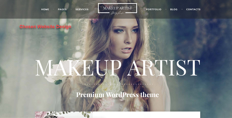
To get a better idea of what Mindy was looking for in her new landing page I sent a list of well designed beauty salon websites and asked her to pick out the best features from among the websites. Mindy did one better and sent me the URL for her favorite overall design which had most of the features she was looking for. Here is that desired new landing page design:

This design had a number of distinctive features and stylings:
- An opening full width hero image with overlay heading and text lines;
- A sticky header with the logo splitting the menu in two. The header is semi-transparent as it moves down the page with scrolling
- Just below the fold, the second section is an About block with styling, image and text copy;
- The third section is a multi-column block showing 3 Services again using an image, text copy and link to Hair, Face, and Eye Makeup pages;
- The fourth section has a special B/A slider displaying before and after makeup treatment – Mindy did not have such images at this time so this section was omitted;
- The fifth section has a simple 3 column pricing table;
- The sixth section has a gallery of Certificates and Awards with full page display box;
- The seventh section has a classic Contact form.
Although not complex, this a formidable list of tasks to do for Mindy’s new landing page especially since I had given myself a time limit of 2 hours to create the Landing Page. The good news for me is that I had both the text copy and many of the images for most of the required sections. So the next phase was to create the landing page.
Landing Page Creation
The first decision was to choose the SiteBuilder combo for the Landing Page. That was made easy by the minimize the cost target. So Elementor was the only free PageBuilder that offered free Header, Footer and Navigation and Sidebar widgets. Another attraction of Elementor was the half-dozen high quality and free extensions available that add some very useful widgets to Elementor.
Now for the MultiLayout theme the choice was tougher. I did not want to use The7 or Xthemes because they bring along too many extra and superfluous plugins – fine for a large website but hard to manage in this smaller setting. Also they have fewer options for customizing page layouts. So the choice involved the three free MultiLayout themes – Astra, Generate Press, or OceanWP. Astra was chosen because it has a library of page and section blocks written for use with Beaver Builder or Elementor Pagebuilders. In addition Astra allows users to create their own headers and footers.
As it turns out Generate Press and OceanWP also have special page and section templates[these are new features appearing in the last 2 months]. And I did not use the header and footer capabilities of Astra. So I could have used any of the three free MultiLayout Themes because their page customizing capabilities are sufficient for this app. There are differences among the three but that is the subject of another review.
So with the SiteBuilder of Astra plus Elementor chosen, here is the workflow used to build the following website:
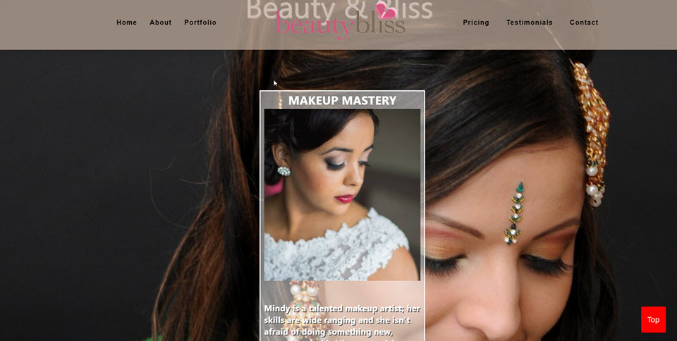 Now the password into the new Beauty Bliss website is the same as the password for this post. As you can see from the screen shot the first 3 design requirements have been met. There is a full-width hero image with Beauty Bliss as both logo and text shadowed header. The header is sticky with two menus on the left and right of the logo. The color of the header is taken from the light brunette colors in the model’s hair. Next the About section is split into two parts – the Makeup Mastery semi-transparent card and then below the fold, the second part of the About section with a flip card sample of Mindy and Pam’s work.Finally, note that the model in the Makeup Mastery card is looking down in the same fashion as the Hero Image model.
So as you can see the layout of the Landing Page takes into account the Makeup Artist theme’s design aesthetic while merging media elements from the original website. As well the choice of typography, text-shadowing use and spacing follows the design theme. This blending of influences would shape the creation of the landing page. What follows are the details of the workflow for creating the Landing Page that became a SPA-Single Page Application.
Workflow For First 2 Hours
The original intent was to create a Landing Page in two hours using the magic of the SiteBuilders. The important first step is get the SiteBuilder settings right. Thus we put the Elementor PageBuilder settings in sync with the Astra theme as seen in the following screenshot of the Landing Page edit screen:
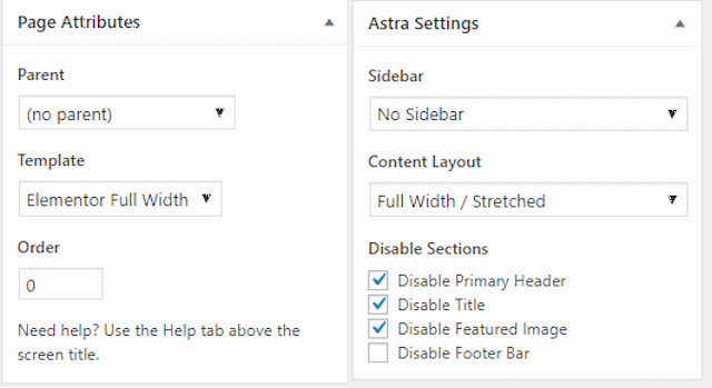
Now the Landing Page is designed to be full width stretching from edge to edge, no sidebar, no featured image and the default header and menus are going to be replaced by our own layout. So the Page Attributes setting tells Elementor to use full width pages and posts. The Astra Theme Settings sync up with Elementor page attributes with a full width stretched layout. In addition No Sidebar, Disable Primary Header, Disable Title, and Disable Featured Image check boxes are clicked to create the blank tabula rasa needed for our Landing Page design to fill in.
So our next task is to replace the page header with our own design. The problem is that neither the Astra Theme nor Elementor have a prebuilt header template with the logo in the middle nor sticky header capability. So we will create our own header with two menus – a left menu of Home About Portfolio and a right menu of Testimonials Pricing Contact. Of course the two menus have to be created outside the Elementor PageBuilder in the Appearance | Menus command:
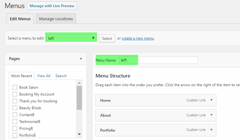
At this point a shortcut taken was to add six empty sections to the evolving page with an identifying anchor in each section – Home, About, Portfolio, Testimonials, Pricing, Contact . This made creating an SPA-Single Page Application much easier because the menu items pointed to the right section of the Landing Page.
The next step was to add a three column widget to the developing header. Placing the Elementor Navigation widget,into the header’s first column was used to link in the left menu. The second column was filled with the Beauty Bliss logo right in the middle of the header. The third column used the Elementor Navigation widget to place the right menu into the right side of the header.

Now the next three tasks to complete the edit of the header are to change the background color of the header to a golden brunette color, make the color slightly opaque and make the header sticky. The tricky part is making the header sticky. Just add the Sticky Menu (or Anything!) plugin and then set the headers CSS identifier in the Sticky Menu settings. It was easy to test that the header was sticky while scrolling down down the mostly empty Landing Page.
Filling in the Home Section
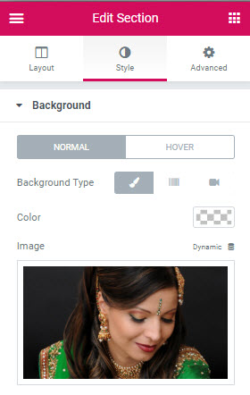 Coding the Home Section was fast and relatively easy. Just go to the Home section and edit the Style option to add the chosen background image. This ability to add CSS styling for every Elementor widget or element is vital to the PageBuilder’s productivity. This is the most incomplete part of the current Gutenberg replacement for the Visual editor. Gutenberg still does not have the range of styling options that are available to most Pagebuilder plugins.
Elementor users [but this also applies to all the top end PageBuilders]know that they can immediately edit the CSS styling for every widget they place on a page/post. In this case our target is the background image for the Home section. Now it is important that this hero image be in the background so the next two elements in the Home section lie on top of the background image. That is the reason an Elementor Image widget cannot be used because all images lie on the top of the page.
The Hero image brings up three added tasks. First, because of thHero image size developers will have to find an image in the 2000 x 1000 px range to cover the desktop. PageBuilders will automatically resize all images to fit on tablets or mobile phones with the notable exception of background images. So developers will have to create cropped background images that fit into the tablet and mobile phone screens. The second media task is that user supplied images often need some extra refinement usually saturation or exposure corrections.
The third media task is to reduce the size of the image file so to decrease page load time[images now comprise 70% of an average page load]. Now developers can use such plugins as reSmush.it and 4 other top rated plugins to do the compression rather than using your favorite photo editor. But for this developer, Riot.exe which runs in Windows only is the image compression utility. The following screenshot shows Riot in action:
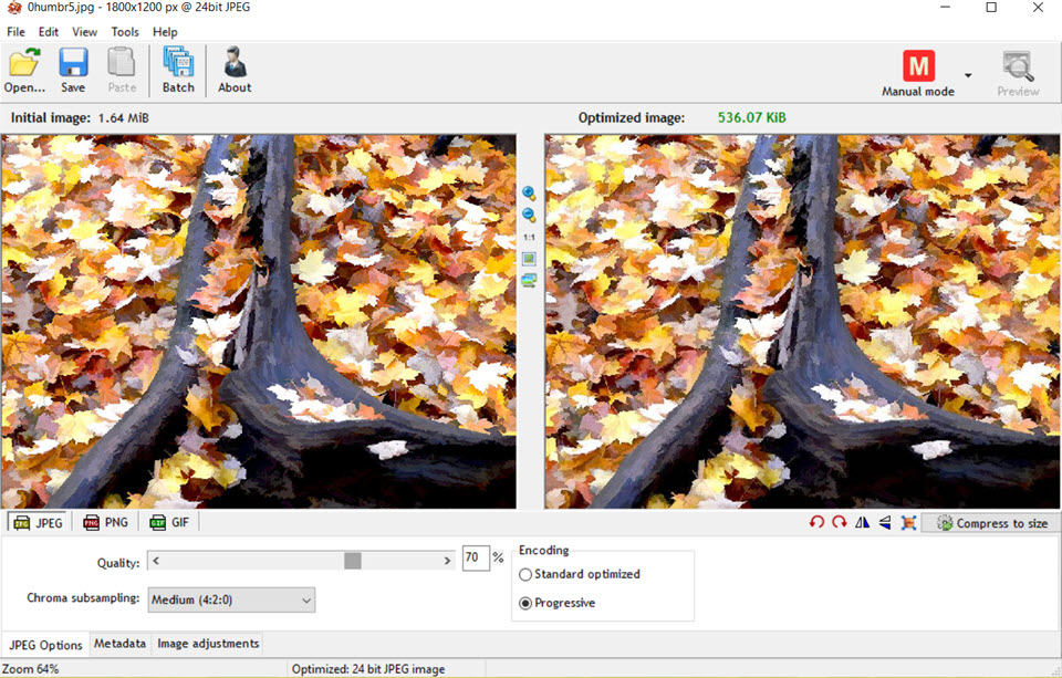
Notice that Riot has cut away 1.11MB from a near hero sized image originally weighing in at1.64MB. This is a substatial improvement and our preferred image compression routine. Riot was used on all the Beauty Bliss pictures. Including the image used in the Makup Mastery card on the Home page.
In fact the next two widgets in the Home section were quick and easy to do. The Text heading Beauty Bliss is just centered Text Editor copy that has an inline style of “<span style=’text-shadow: 2px 2px #999;’>” to create the text shadow. Just below is the Makeup Mastery card that is also easy to do with special trick to make centering the card easier.
First we insert a 3 column row just below Beauty Bliss text. Then inserting the Text Editor card in the middle column allows us to precisely position the Makeup Mastery card by dragging on the edge of the 2nd column on the right and left this . As for the contents we use the same text shadow CSS styling but different font sizes. And the final step is to add the specially cropped image where the model is glancing down to the right just as in the background Hero image. So the next stage is the About section.
Using an Elementor Flip Card Simplifies Layout of About Section
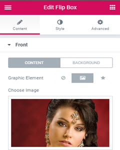 Beauty Bliss has two principal team members, Mindy the makeup specialist and Pam the hair stylist. So an Elementor Flip Card was the natural choice to use for the About section. My problem is that I did not have pictures of either Mindy or Pam. So instead I used pictures of their makeup and hairstyling work. It would be easy to change these images to the two artisans.
Also the copy for each craftswoman can be added to or completely replace the existing copy. As you can see from the screen shot the Flip Card allows for Front and Back layouts of Image plus copy below. Given the many Makeup and Hair Styling images available from the original website and its galleries, it was easy to choose an image to use for both Mindy’s and Pam’s work. But it also important to note that changing these images is an easy to do DIY task in Elementor.
By the way the red and green colors used throughout the remaining sections were taken from the model’s garment shown in the Hero image. Use the ColorZilla Chrome browser widget [it is also available in Firefox]. Or the color samples can be taken from the eyedropper tool in most photo-editors.
Finally, Elementor allows users to control the Flip Card animation in its Content | Settings option. At first the default flip card animation was used. The animation is triggered by hovering over the flip card. But users found the flip card animation distracting, almost obnoxious. So we tried a number of alternative setting and have left it at Zoom-in for now. The About Section was done in less than 10 minutes.
Starting the Portfolio Section
The new websites Portfolio section follows the layout but not the styling of the Services section of the Makeup Artist design template. Because I was running out of time given a two hour deadline to create the new website I did not attempt to approximate the decorative styling of the Services section used in the Makeup Artist design templates.
Yes, three columns were used with borders and box shadows. And copy for the Hair Design, Makeup and Fashion Styling was borrowed from the original Beauty Bliss website and added to each of the columns. But the results were threadbare so I added appropriate images to the top of each service column.
However, there was very little copy available for the Fashion Styling third column. So I added an image from one of the fashion shows to fill in the gap. The Services section took longer to do then expected because border, box shadow, and gutter width between the columns was simply not working as expected. I am not sure if this is a bug in Elementors complex styling options. But what should have been fast and easy, actually took nearly half an hour to do.
Now the final prototype of the Services section in the Beauty Bliss Landing Page has a number of features that were added later. For example there is a simple 3 image gallery with popup box for the first column Hair Design. The Makeup Work in the middle column has a button, See Makeup Styles at the bottom. Clicking this button pops-up a slider with with 18 examples of MakeUp Styling. Likewise in the third column there is button See Fashion Styles. Click on this button to see a popup Carousel of fashion show images.
Finally, the color waves Elementor Divider at the bottom of the Services Section was added during the second iteration on the website. So now, running out of time I moved quickly onto the testimonials.
Speeding Through The Testimonials Section
With about fifteen minutes of my allotted 2 hours development time left, I looked at the Testimonials section on the original website. A good set of quotes but no pictures of the people, no location, no description of the person. In contrast the Elementor widget expects all of these as shown below:
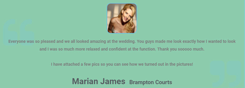
So having no time to trackdown the missing info with Mindy, I created a prototype Elementor Text Edit block with border, margin setting plus a box shadow. Then I duplicated my Testimonial block 7 times dragging and dropping them over and into the 3 column row inserted just below the Testimonial header. Then all I needed to do was fill in each of the Testimonial blocks by copying and pasting the testimonial copy from the original websites Testmonials page. I finished about 25 minutes over my intended 2 hour development time.
But I still had the Pricing and Contacts Sections to do. This was a lot of Mop Up work. And as it turned out those two sections took another 2 and 1/2 hours to do. This time a bug in Elementor which refused to display tex blocks the way needed took the most overtime. I conversed with Elementor support staff trying to trace out the problem for over an hour – and was promised a fix in the next Elementor release. And the final fixup work took another three hours to Contact Form, Net result, a six page SPA app took a total of 8 hours to get to a credible first release candidate.
Summary
Despite taking more time to do than anticipated [see another SiteBuilder demo developed with time to spare here], this Live Demo of SiteBuilders certainly delivered a range of useful results. First, SiteBuilders can deliver customized designs and layouts to any page or post. And UI layout is improved for DIY users because they see their edits done immediately on the frontend -> convert a two column horizontal layout into a two row vertical design with more generous spacing.
If the user has basic CSS skills than the SiteBuilder’s styling options attached to every widget allow for “see immediately how it works” styling of pages for color, spacing, typography and graphic “fit”. And for developers the Stebuilders pro features like customized page and section templates save chunks of development time – as in the use of Testimonial template blocks above.
Another factor to consider is how much media and especially images impacted the Landing Page development. For example, as of 2017 images alone comprise 66% of the page load weight. On this project there were plenty of good images with a minimum amount of time required to refine the exposure and color balance. But there was a significant amount of time needed to crop images to fit the area available in the various blocks and sliders used. Finally, almost all of the images had to be compressed to make significant load time savings. In general, as video and images continue to be vital content especially for retail, travel and event websites, expect media management to be a significant factor in overall web development time.
Okay this developer has to admit that it took at least quadruple the allotted 2 hour time to complete the Landing Page. However, we have delivered a solid six page prototype SPA app that works remarkably well on mobile, tablet and desktop. Yes, there is a lot of clean up work to do in typography, spacing, color styling and image sizing to put a super polish on the new Landing Page that became a SPA app. And so 8 hours to deliver a very solid Single Page Application prototype is satisfying.
In fact, it was reassuring to see that WordPress SiteBuilders are able to deliver competitive mobile apps. As the web moves vigorously towards mobile first apps and solutions [think Phonegap/Xamarin, Electron apps, PWA, etc], it was encouraging to be able to use the WordPress SiteBuilder’s ability to specifically edit the tablet and mobile views in detail. This underlines the fact that WordPress with SiteBuilders can play well in this emerging Mobile Web courtyard.

