Gutenberg Review
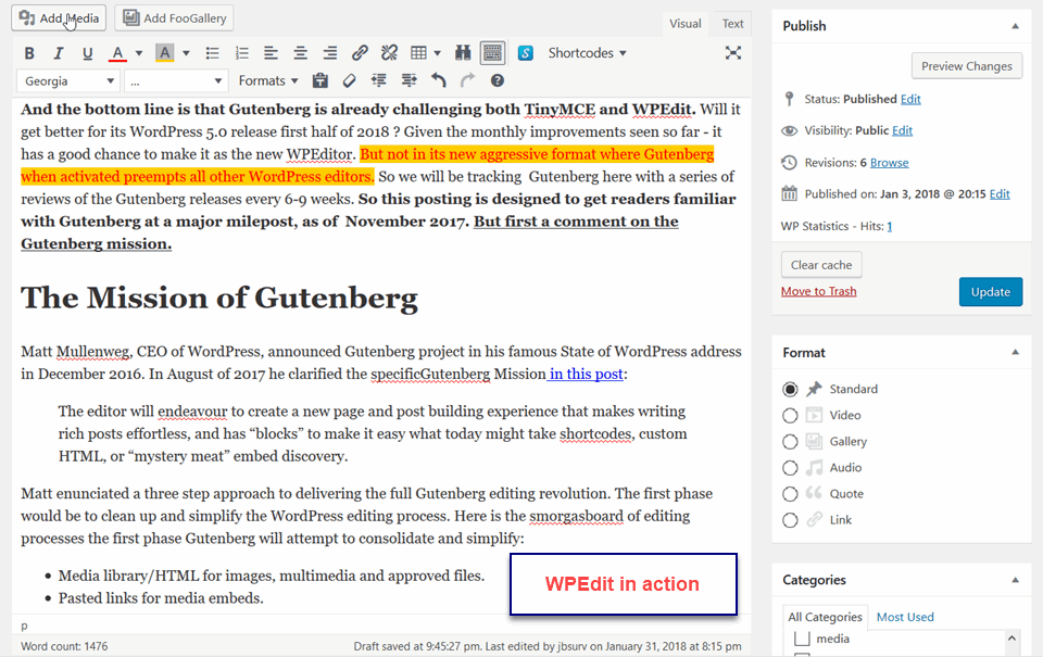
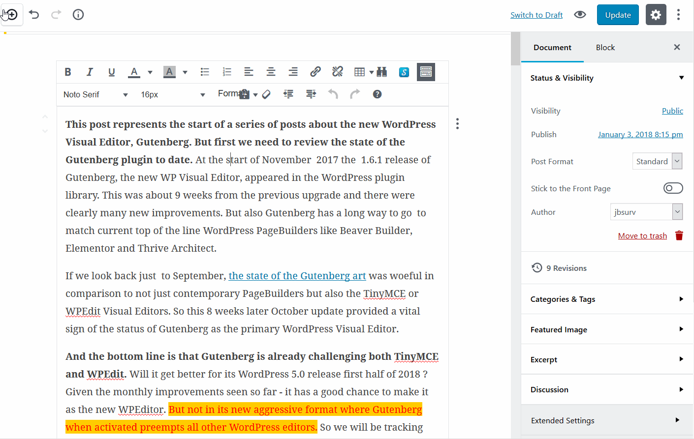
As promised in our previous Gutenberg posting, this is the first of a continuing “look see” at how Gutenberg is progressing. The 2.1 Gutenberg is showing much more refinement throughout. For example, in the edit sidebar which shows the pervasive use of accordion toggles throughout the Gutenberg editor. Also the sidebar is more complete, particularly the extended setting where theme and plugin widgets can add their options. But clearly Gutenberg is not a frontend editor, its width does not reflect at all the full width page that this will be used on.It is interesting to compare the look of the WPEdit Classic text editor versus the Classic version used in Gutenberg:
The first item to note is that I was unable to change the background color of the gallery images to match the gray paragraphs being used throughout this post. Also I just tried to select the words “back ground color” and set them to red. But Gutenberg ignored the selection and set all of the text in this paragraph to red.
This means that fine font control that is available in the WPEdit Classic editor for selected font color and font background color are not available in Gutenberg yet. It also means continued frustration in finding a text tool that allows fine font-control like line-height, kerning spacing, text-decoration, etc.
So our next test is to see how well pull quote works:
“To arms to arms the Nukes are coming”
Duh reel donald trump
Curses foiled again trying to use columns – only text and then absolutely no Styling available!
Bah HumBug!!
Summary
Clearly Gutenberg is making a broad range of small improvements. But so are the better PageBuilders . Thus, the net result is that Gutenberg will still be well behind what users can get done with the drag and drop, immediate styling that is available from free PageBuilder like Beaver Builder Lite, Elementor, and Site Origins PageBuilder


